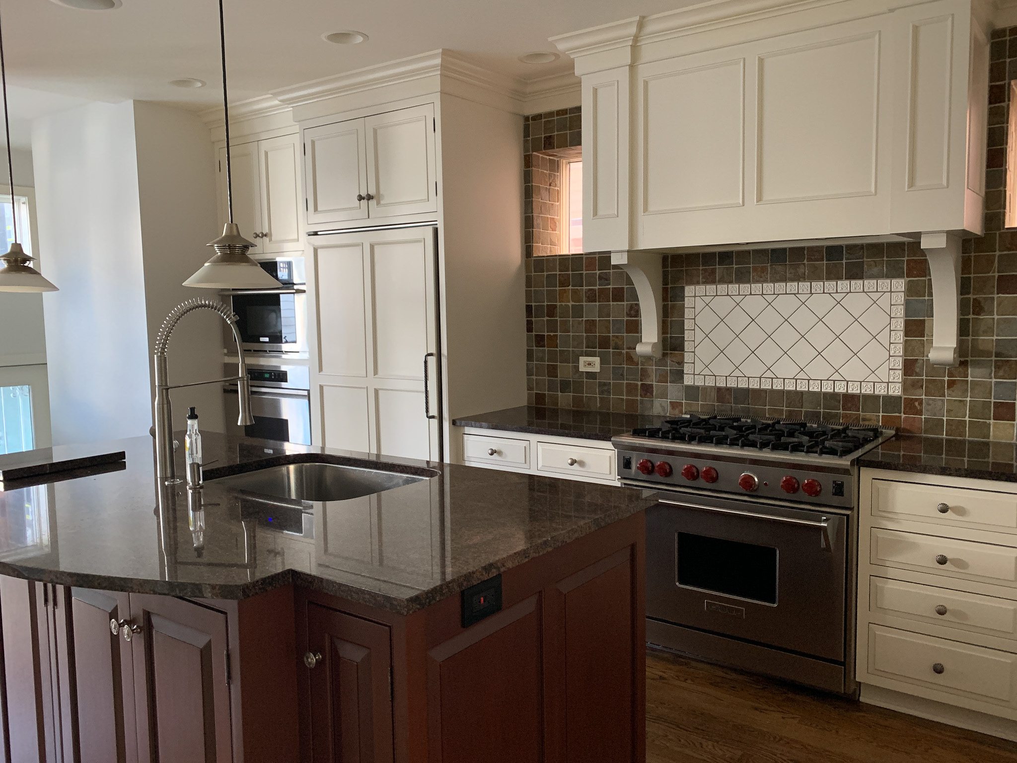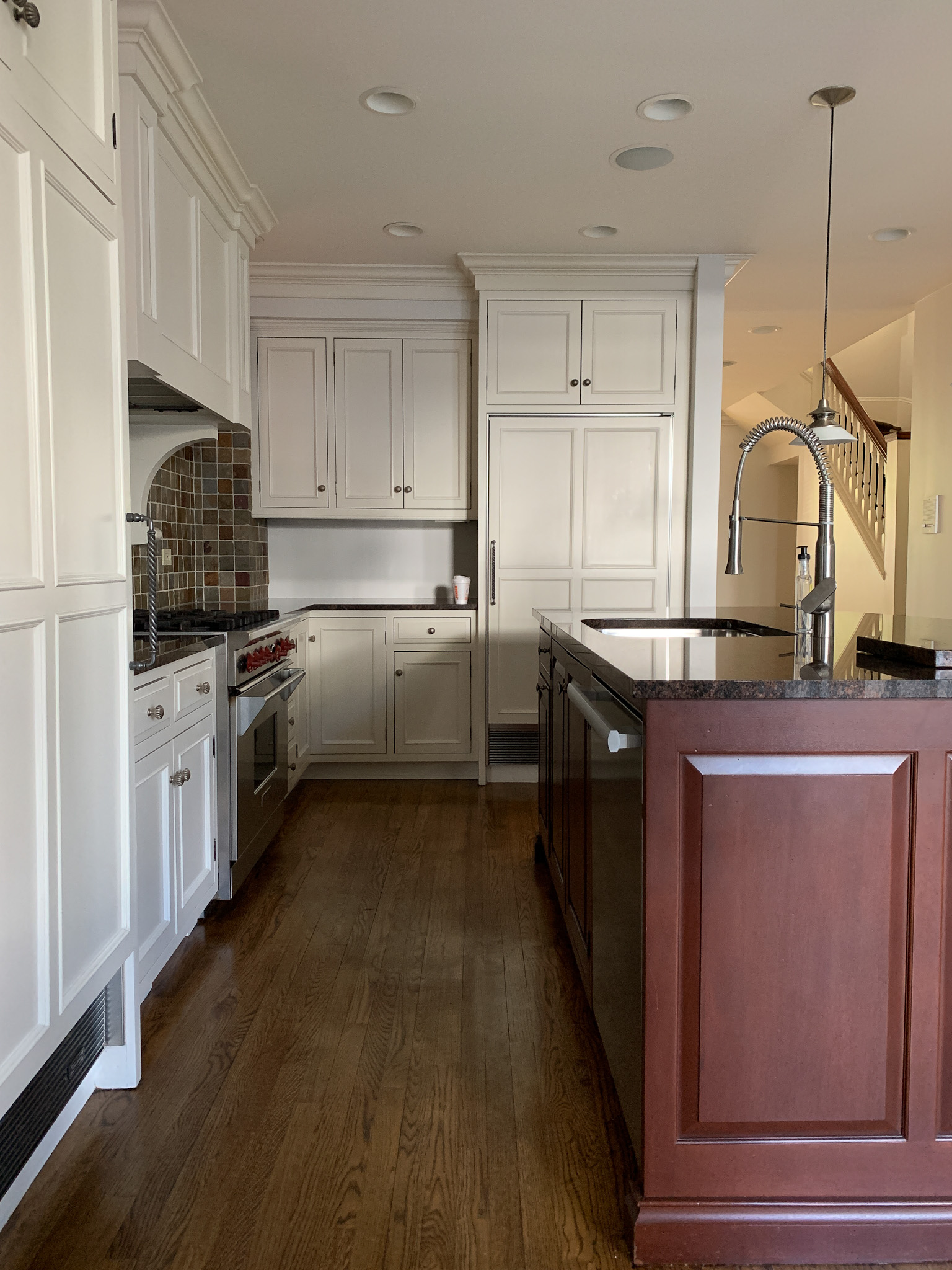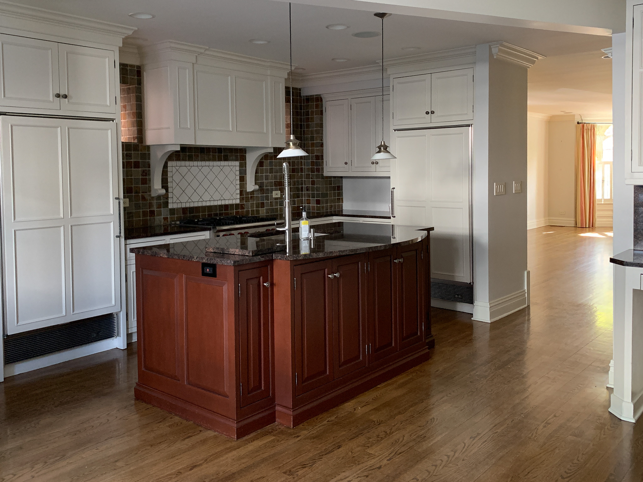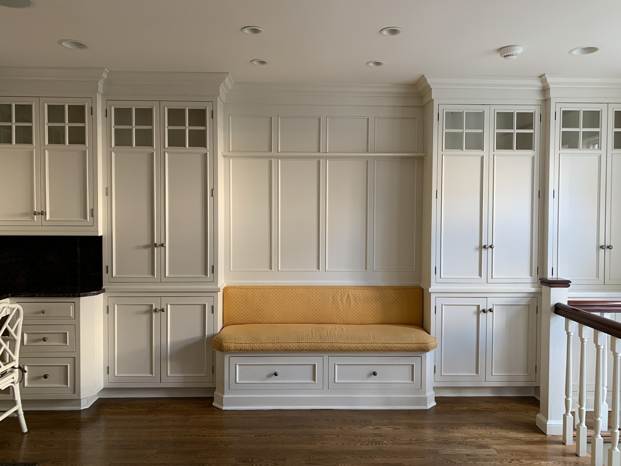
We’re having our kitchen cabinets painted this week! If you’ve been following along for a while, you likely know that the cabinets have yellowed over time. This is likely due to an oil-based paint being used many years ago, so it’s time to freshen things up and give them a white coat!
While we’re at it, we’re going to update the hardware, lighting and seating as well. A huge thank you goes out to Kira from Kira David Design—now serving Chicago, Boston and Rhode Island!—as well as my friends Bradley (who will one day have her own design company) and Shaheen (who’s in the middle of renovating her kitchen) for helping so much with this project. It was quite the rollercoaster as there were so many confusing aspects and little details to consider. But my friends are the best and have way better taste than I do… and I’m so excited about everything we settled on!
Here’s everything, including before photos:
What we’ve already done
Quartz countertops: When we moved into the house, we very quickly replaced the countertops to brighten and modernize the space. We’d just had Lucy and wanted something quick and easy, so we went with these quartz countertops from Home Depot… and I’m so happy we did! First, they were so much more affordable than other options we’d explored for our previous home. Second, they’re beautiful! And third, they’ve held up exceptionally well over the last (almost) couple of years. Not a single scratch or stain. I’m amazed!
Note: We went with quartz because we couldn’t handle the stress of having marble with young children. I think you really just need to know the kind of family you are when making this decision. 😆 The Larkin Family is a hot mess, and we own that. It’s fine. And that’s why we cannot have marble. I mean, we *could* have marble… but that would entail Mitch and me freaking out about countertops all the time. Which is so not something I ever want to do. One day, when the girls are less destructive—did anyone see Lucy’s artwork all over the kitchen cabinets the other day?!—I would love to install a butcher block countertop on the kitchen island. For now, though, I love how bulletproof our quartz is! We cook, paint and spill red wine without worry and I love it.
Herringbone marble backsplash: Home Depot installed this as well! Mitch picked it out, and I’m absolutely in love with how it turned out. I will say that over the last two years, I haven’t loved how the Carrara marble accentuates the yellowing cabinets, haha. But that’s not the tile’s fault, and the new white paint will really complement it. :) I can’t wait to see the backsplash in all its glory… so soon!
Scalloped marble backsplash (desk): This was my pick. :) As you probably know, I love scallops. And since the desk is across the room, I figured why not give the space a little character and differentiate it from the rest of the kitchen?! The desk cabinets aren’t yellowing as badly, and Calacatta marble is far less blue than Carrara… so this might add to why I’m so in love with how it turned out, haha. Only time will tell.
Bench upholstery: At the moment, the bench looks VERY white against the cabinets, and I’m a little worried about that. (It’s a life proof fabric, which is why I picked it, despite all the white!) With any hope, the new paint evens everything out. If not, oh well. 😜
What we have planned
The paint: We used Samplize.com, recommended by Kira, to figure this one out! Samplize sends out stick-on paint samples that are painted with real paint. It’s incredible. They’re also only something like $5 each. HIGHLY recommend. I ordered Benjamin Moore “Ivory White” (current color), Benjamin Moore “Simply White” (very popular), and Benjamin Moore “Chantilly Lace” (which a few friends have used). I expected myself to love “Simply White,” but when I got the samples up there and observed them at different times of the day, the obvious answer was “Chantilly Lace.” (“Simply White,” while much whiter than “Ivory White,” still read very warm as the kitchen is a west-facing room.) It was pretty mind-blowing! Anyway, this is a great way to make decisions if you don’t love the idea of actually painting. They peel right off!
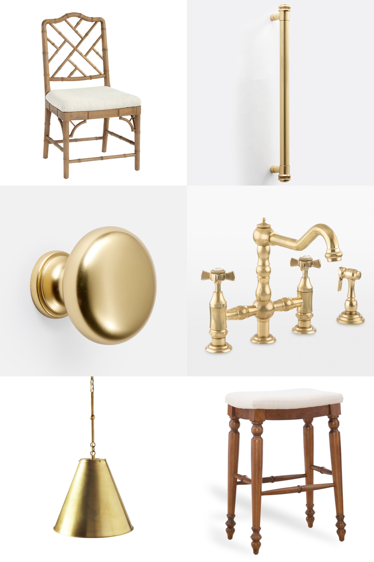
The cabinet knobs: I spent all of 10 minutes scrolling through Rejuvenation’s cabinet hardware before I fell in love with the Massey knobs in “Aged Brass.” I believe it’s the company’s most popular knob, too?! (So that made me feel more confident in the decision, haha.)
Hinges: I should note that we also need to switch out the pewter hinges for brass ones. Not exciting and quite the confusing hassle as there are one zillion mistakes a gal can make while ordering. Kira to the rescue, though. The two options here (because of size) are this one from Rejuvenation and this one from Build.com. We’ll use whichever ones arrive first!
The fridge/freezer pulls: This was hard. There is no Massey appliance pull, therefore I had to find something that complemented the knobs. And since our house is obviously very traditional, I initially ordered these, thinking they were perfect. But alas, Rejuvenation e-mailed me one day before the painter’s arrival and told me that they wouldn’t be arriving until May. (FUN!) Because the painter needed to know the footprint of the two attachment points, this wouldn’t work… so I ran over to Rejuvenation in Lincoln Park to see if they had anything that would work. By some miracle, they had three Rigdon appliance pulls in Aged Brass in stock—and after consulting a few friends, we determined that the Rigdon was actually far prettier than the Mission. Hallelujah!
The faucet: This won’t be arriving until May, but no big deal. I love it, and I especially love that it perfectly matches the knobs and appliance pulls!
The kitchen island light fixtures: I initially decided to go with these candlestick lantern-like pennants, but my friends talked me into trying something new and going with the small “Goodman” fixture in brass. I’m so happy they did! While they’re definitely not something I would have picked out on my own, I’m actually excited about the change. I clearly lean traditional, but having a touch of industrial—or whatever this is, haha—will add some dimension to the room.
The kitchen island stools: YAY. Guys, I’ve been searching for very traditional backless kitchen island stools since we moved into the house. (Stools with backs don’t fit.) But nearly everything I found was either beachy or way too modern. These, though, are perfect. I’m so thrilled. I’m also thrilled that the tops can be reupholstered when we inevitably ruin them. ;)
The kitchen table chairs/desk stool in “Natural Oak”: One thing I was always set on? The Dayna collection! SO BEAUTIFUL. I’ve always adored Chippendale, and the natural oak color is lovely. While the desk stool is backordered, I already have the kitchen table chairs in place and I’m so happy with them!
Before photos
Here are unedited photos I took of the kitchen when we moved in! Stay tuned for the final reveal!
