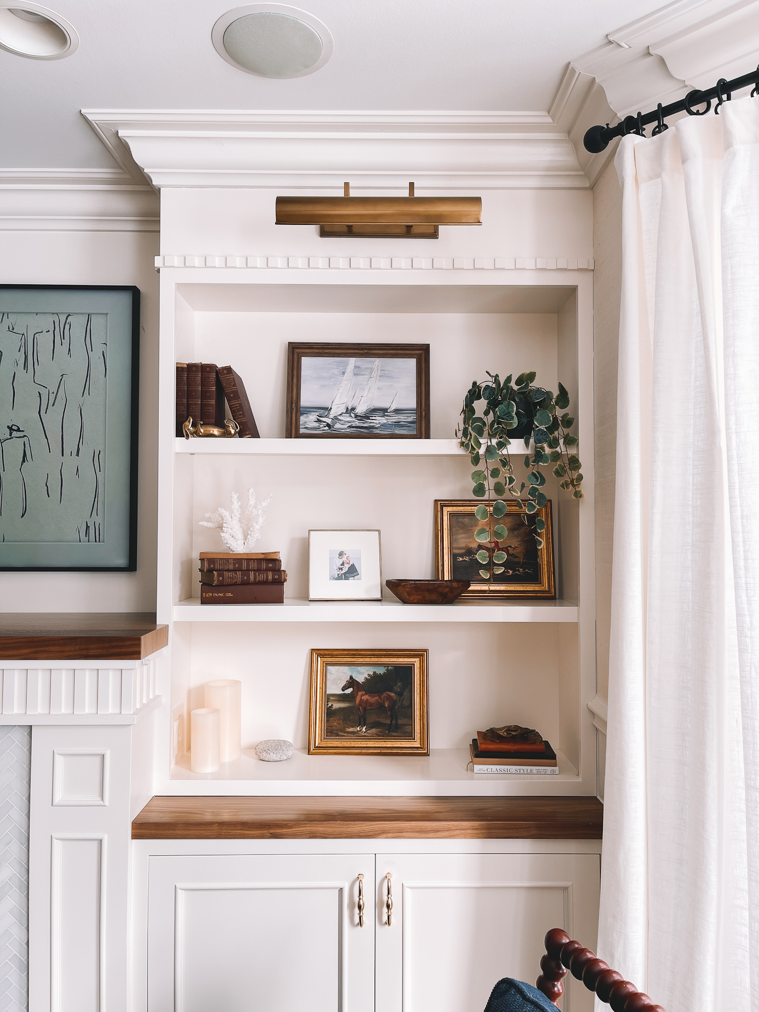
Built-Ins Design: Kira David Design (Chicago/Boston/Rhode Island/Remote Clients) / Spool Chairs / Curtains / Wallpaper in “Cream” / Framed Horse Canvases / Brass Frame / Framed Sailboat Canvas / Faux Trailing Plant / Faux Coral / Brass Dachshund / Brass Crab / Brass Pulls / Picture Frame Light / Frame Television (Read Mitch’s review here.) / Frame TV Art / Built-Ins Paint Color: Benjamin Moore Ivory White #925 (Though I prefer Benjamin Moore Dove Wing for white paint, and White Dove for trim!)
I’ve been really working on our shelf decor. For the longest time, I just threw stuff up there and would hope that it’d work, but things were starting to feel very cluttered. I took everything down after the holidays and thought about which pieces brought me the most joy, and then either found homes elsewhere around the house or donated. The shelves aren’t perfect—for starters, I obviously need to move the mini brass frame on the middle shelf and space out the others 🙈—but I love my little work in progress!
Here’s my approach to decorating shelves:
(Feel free to chime in, though!)
Identify a style/color scheme: My first step is browsing Pinterest while watching TV with Mitch. ;) I save a few Pins I like to a folder, and then go back through and highlight what aspects of each photo I was likely drawn to the most. I’m currently loving neutrals, dark wood and leather, whites and blacks, brass, natural textures and greenery. I would say my style is traditional with modern touches. (For example, the ruffled bowl and the limestone links probably aren’t the most traditional decor, but they seem to balance everything. Come to think of it, I need a modern touch on the right-hand shelves!) I’ve realized that none of the inspiration photos that I’ve saved include tons of blue, so I’m experimenting with leaving blues out for now.
Take everything down: Starting with a true blank canvas is the best way to achieve a totally fresh look. I’m constantly surprised by how different shelves can look when I stop rearranging the current design and simply take it all down and start again. (I do, however, snap a photo beforehand just in case I hate the new attempt. 😆)
Remember the “rule of threes”: Grouping objects in threes or in larger odd numbers tends to make spaces look balanced. Similarly, different shapes, sizes, heights and colors are helpful. I clearly haven’t mastered this art yet, haha, but I keep it in the back of my mind when attempting to spruce up our home!
Embrace white space: At the same time, tons of objects can leave shelves looking cluttered. Less tends to be more, and white space can provide great contrast for favorite decor.
Work mostly with what is already owned: My mother-in-law is a pro at moving decor around the house to get a fresh feel every few weeks. It’s a great way to A) Not accumulate unneeded stuff, B) Save money, and C) get creative. Seriously try walking around the house and grabbing things that catch your eye. From art and old books with spines that work with your color scheme to knick knacks and even dinnerware, you can create something beautiful out of stuff you already own.
Fill in the gaps with Target, other discount stores, and vintage shops: I love Pottery Barn, West Elm, Crate & Barrel and CB2 just as much as the next gal. And I do own a few pieces that I absolutely adore! But I normally try to find similar pieces at Target (usually the McGee and Magnolia lines) and other discount/vintage shops. It just involves a little searching. No need to spend $100+ on a simple brass frame, for example, when this gorgeous one is $12.99. (Seriously, my favorite. I own several! The tiny square size is the best.)
Don’t feel guilty about letting go of decor that no longer brings joy: I used to hold onto decor just because it had “always” been with me. Scroll to be bottom of this post and see if you can find the bright blue vase. I hated that thing—no particular reason why, haha—but it was literally the first piece of decor I acquired when I moved to New York City as a 21-year-old. So I kept it… until LAST YEAR. (When I was 36.) Once I gave it away, I felt a sense of relief 😆 and I started to identify a style that was more me.
Consult a designer or friend with design skills: We all know that person who has a knack for interiors! TEXT THEM. They’ll be flattered! Two of my best friends—Kira from Kira David Design (who designed our built-ins) and Bradley (soon to be famous, I promise)—are incredibly talented, and they’re always helping me. Of course, I try not to abuse my friendships 😜, but sending project pics back and forth is fun and brings us closer.
Don’t get discouraged: I wouldn’t say that interior design is my calling, but I enjoy it and I’m learning. And looking back at our first home (see bottom photo), I can confidently say that I’m improving! Decor and design is ever-evolving, just like we are as people. :)
Any tips you have to add?
Shoutout to Kira David Design for the gorgeous built-in design and construction. I love you, Kira! (Note: She serves clients in Chicago, Boston and Rhode Island as well as remote clients around the country and world.
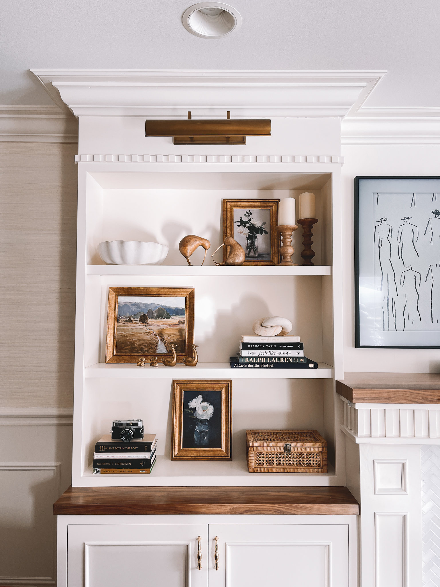
Scalloped Bowl (THE DEAL OF THE CENTURY! Original inspiration here and here.) / Mango Wood Kiwi Birds / Pillar Candle Holders / Newer Cane Box / Knotted Limestone Figurine (This one is nearly identical!) / Old Framed Canvases from Target but try McGee & Co. for gorgeous art! / Vintage Brass Ducks from my friend Bradley! / Vintage Camera / Wallpaper in “Cream” / Picture Frame Light / Brass Pulls / Books: Magnolia Table, Feels Like Home, Ralph Lauren, A Day in the Life of Ireland, The Perfectly Imperfect Home, Dogs of Central Park / Frame Television (Read Mitch’s review here.) / Frame TV Art / Built-Ins Paint Color: Benjamin Moore Ivory White #925 (Though I prefer Benjamin Moore Dove Wing for white paint, and White Dove for trim!) / Built-Ins Design: Kira David Design (Chicago/Boston/Rhode Island/Remote Clients)
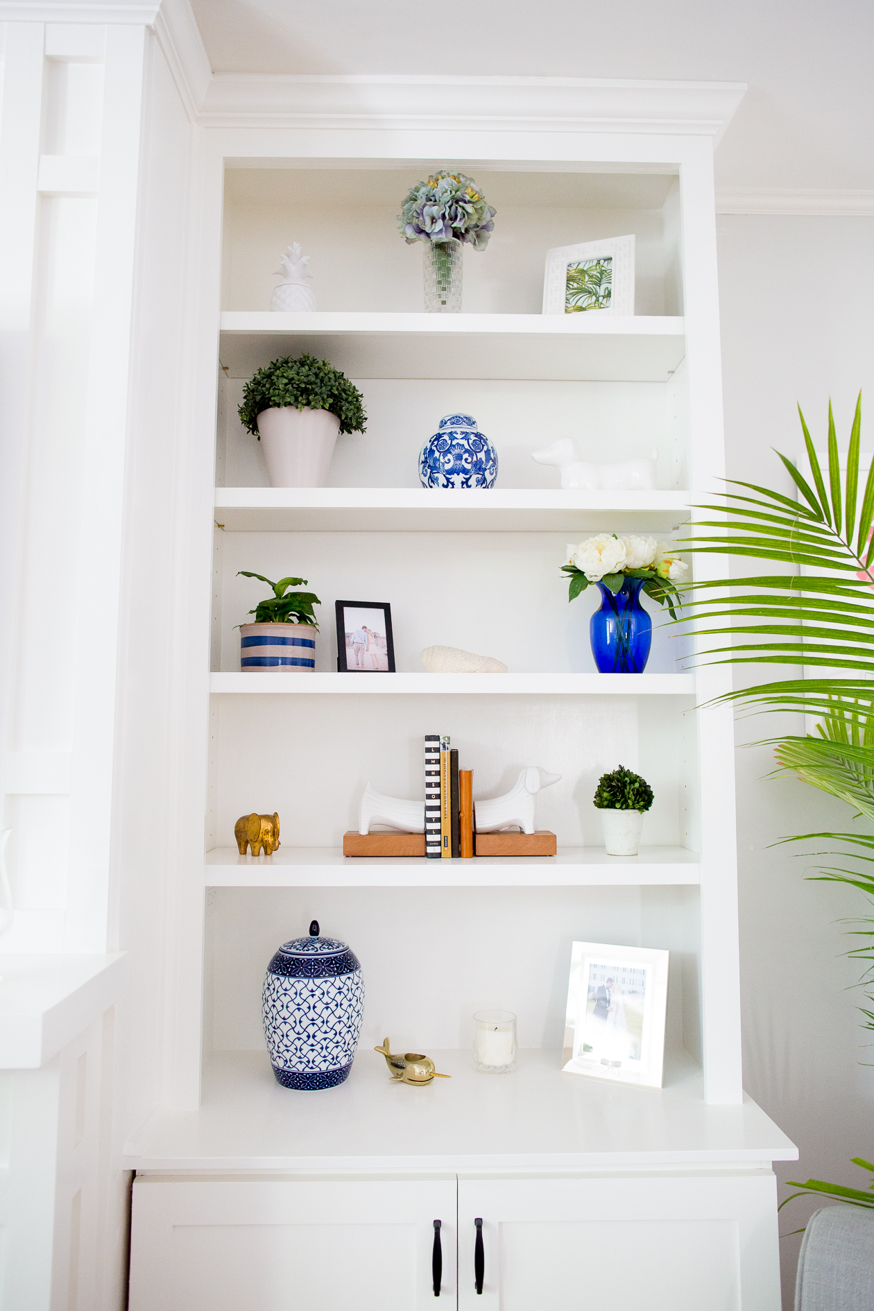
Shelf decor in our first home ^
We’ve come a long way! :)

